Xamarin Forms has had support for Dark Mode for a while now. However, how it is supported has changed, and finding the "simple" way to do this is less than intuitive. If you are like me, you most likely stumbled across the Modernizing iOS Apps with Dark Mode article and tried to go down that pathway. I was able to be successful at it; however, the impact on my development patterns was less than ideal.
Introducing AppThemeBinding
After spending more time than I wanted going down the other road, I found that Xamarin Forms 4.7 added a new Markup Extension AppThemeBinding that allows us to bind values based on the current operating mode of the application. This process is done automatically based on the device's theme and requires only enabling a feature flag.
Converting the Template Project
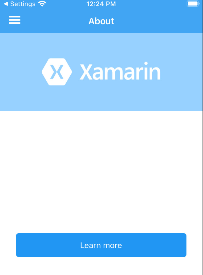
I started down this road after creating a new project and running it in dark mode and noticing a display similar to the image to the right. I had hoped that out of the box, we would have a better overall experience, as disabling support for dark mode is not all that easy to understand.
To this point, I created a new GitHub project, Xamarin Forms Shell Dark Mode, to work as a working example and documentation for how you can introduce support for dark mode for your project.
The following steps will walk through the changes necessary to enable Dark Mode support, using the default content & structure that comes with the sample project. The starting point at this stage was "File" -> "New Project" and selecting Xamarin.Forms as the project type using the flyout menu option. You can also roll a fork of the demo repository back to that point to follow along step-by-step.

Step One - Update NuGet
When you create a new project it is using an older version of Xamarin Forms, you need to update to the latest version using NuGet Package Manager. I upgraded this example to the latest as of today which is 4.8.0.1534, however, anything 4.7.x and later should work as the feature for AppThemeBinding was added in 4.7.
Step Two - Enable App Theme Experimental Feature
The feature required to enable the functionality is hidden behind a feature flag. Inside of your projects App.xaml.cs file we will need to add the following line of code, just before the existing InitializeComponent() call.
Xamarin.Forms.Device.SetFlags(new string[] { "AppTheme_Experimental" });
Step Three - Define Color Sets
The AppThemeBinding process works by allowing you to define different resources for individual themes. In our case, this will be different colors; eventually, you might also need to provide different icons or other items, which is possible. We will add all of these to the App.Xaml resource dictionary. For our theme, we will be using the following basic colors.
- Backgrounds Dark Mode = #111111
- Backgrounds Light Mode = #FFFFFF
- Text Dark Mode = #FFFFFF
- Text Light Mode = #000000
- Button/Selected Backgrounds (Light/Dark) = #2196F3
- Button/Selected Text (Light/Dark) = #FFFFFF
It just so happened that some of the colors we are able to re-use for light and dark, but for ease of use, I still created different color styles for the options as it allowed for a more clean process. You will want to add the below entries to your ResourceDictionary at the top of the App.Xaml.
<Color x:Key="BackgroundColorDark">#111111</Color>
<Color x:Key="BackgroundColorLight">#ffffff</Color>
<Color x:Key="TextColorDark">#ffffff</Color>
<Color x:Key="TextColorLight">#000000</Color>

<Color x:Key="HeaderBarBackgroundColorLight">#2196F3</Color>
<Color x:Key="HeaderBarBackgroundColorDark">#111111</Color>
<Color x:Key="HeaderBarTextColorLight">#FFFFFF</Color>
<Color x:Key="HeaderBarTextColorDark">#FFFFFF</Color>

<Color x:Key="ButtonBackgroundColorLight">#2196F3</Color>
<Color x:Key="ButtonBackgroundColorDark">#2196F3</Color>
<Color x:Key="ButtonBackgroundDisabledColorLight">#332196F3</Color>
<Color x:Key="ButtonBackgroundDisabledColorDark">#332196F3</Color>
<Color x:Key="ButtonTextColorLight">#FFFFFF</Color>
<Color x:Key="ButtonTextColorDark">#FFFFFF</Color>


<Color x:Key="AccentColorLight">#96d1ff</Color>
<Color x:Key="AccentColorDark">#111111</Color>


<Color x:Key="PrimaryBackgroundDark">#2196F3</Color>
<Color x:Key="PrimaryBackgroundLight">#2196F3</Color>
<Color x:Key="PrimaryTextDark">#ffffff</Color>
<Color x:Key="PrimaryTextLight">#ffffff</Color>
Step Four - Update Existing Button Style in App.xaml
The default template has a single style in the App.xaml for the TargetType of a button. We will update that style to have the following declaration.
<Style TargetType="Button">
    <Setter Property="TextColor"
            Value="{AppThemeBinding Dark={StaticResource ButtonTextColorDark},
                        Light={StaticResource ButtonTextColorLight}}" />
    <Setter Property="VisualStateManager.VisualStateGroups">
        <VisualStateGroupList>
            <VisualStateGroup x:Name="CommonStates">
                <VisualState x:Name="Normal">
                    <VisualState.Setters>
                        <Setter Property="BackgroundColor"
                                Value="{AppThemeBinding Dark={StaticResource ButtonBackgroundColorDark},
                        Light={StaticResource ButtonBackgroundColorLight}}"  />
                    </VisualState.Setters>
                </VisualState>
                <VisualState x:Name="Disabled">
                    <VisualState.Setters>
                        <Setter Property="BackgroundColor"
                                Value="{AppThemeBinding Dark={StaticResource ButtonBackgroundDisabledColorDark},
                        Light={StaticResource ButtonBackgroundDisabledColorLight}}"  />
                    </VisualState.Setters>
                </VisualState>
            </VisualStateGroup>
        </VisualStateGroupList>
    </Setter>
</Style>
You can see here that we changed situations where color was set to a specific value to set the colors using an AppThemeBinding and a specification for Light and Dark modes. We will use this concept to address all additional styles.
Step 5 - Add Styles for Standard Content
Within the application, we utilize ContentPage, Grid, StackLayout, and RefreshViews for UI elements. These do not appear to carry forward the default styles for the mode, so we need to add additional target definitions for these controls to set their background colors. We can add this just below the existing Button style.
<Style TargetType="ContentPage">
    <Setter Property="BackgroundColor"
            Value="{AppThemeBinding Dark={StaticResource BackgroundColorDark},
                        Light={StaticResource BackgroundColorLight}}" />
</Style>
<Style TargetType="Grid">
    <Setter Property="BackgroundColor"
            Value="{AppThemeBinding Dark={StaticResource BackgroundColorDark},
                        Light={StaticResource BackgroundColorLight}}" />
</Style>
<Style TargetType="StackLayout">
    <Setter Property="BackgroundColor"
            Value="{AppThemeBinding Dark={StaticResource BackgroundColorDark},
                        Light={StaticResource BackgroundColorLight}}" />
</Style>
<Style TargetType="RefreshView">
    <Setter Property="BackgroundColor"
            Value="{AppThemeBinding Dark={StaticResource BackgroundColorDark},
                        Light={StaticResource BackgroundColorLight}}" />
</Style>
Step Six - Adjust Shell Styles
The final step is to update the styles within AppShell.xaml to follow the same pattern. For simplicity, the next snippet is the entire ResourceDictionary updated within the AppShell.xaml.
<Style x:Key="BaseStyle" TargetType="Element">
    <Setter Property="Shell.BackgroundColor"
            Value="{AppThemeBinding Dark={StaticResource HeaderBarBackgroundColorDark},
                        Light={StaticResource HeaderBarBackgroundColorLight}}" />
    <Setter Property="Shell.ForegroundColor"
            Value="{AppThemeBinding Dark={StaticResource HeaderBarTextColorDark},
                        Light={StaticResource HeaderBarTextColorLight}}" />
    <Setter Property="Shell.TitleColor" Value="{AppThemeBinding Dark={StaticResource HeaderBarTextColorDark},
                        Light={StaticResource HeaderBarTextColorLight}}"/>
    <Setter Property="Shell.DisabledColor" Value="#B4FFFFFF" />
    <Setter Property="Shell.UnselectedColor" Value="#95FFFFFF" />
    <Setter Property="Shell.TabBarBackgroundColor"
            Value="{AppThemeBinding Dark={StaticResource HeaderBarBackgroundColorDark},
                        Light={StaticResource HeaderBarBackgroundColorLight}}"/>
    <Setter Property="Shell.TabBarForegroundColor"
            Value="{AppThemeBinding Dark={StaticResource HeaderBarTextColorDark},
                        Light={StaticResource HeaderBarTextColorLight}}"/>
    <Setter Property="Shell.TabBarUnselectedColor" Value="#95FFFFFF"/>
    <Setter Property="Shell.TabBarTitleColor"
            Value="{AppThemeBinding Dark={StaticResource HeaderBarTextColorDark},
                        Light={StaticResource HeaderBarTextColorLight}}"/>
</Style>
<Style TargetType="TabBar" BasedOn="{StaticResource BaseStyle}" />
<Style TargetType="FlyoutItem" BasedOn="{StaticResource BaseStyle}" />

<!--
Default Styles for all Flyout Items
https://docs.microsoft.com/xamarin/xamarin-forms/app-fundamentals/shell/flyout#flyoutitem-and-menuitem-style-classes
-->
<Style Class="FlyoutItemLabelStyle" TargetType="Label">
    <Setter Property="TextColor" Value="{AppThemeBinding Dark={StaticResource HeaderBarTextColorDark},
            Light={StaticResource HeaderBarTextColorLight}}"></Setter>
</Style>
<Style Class="FlyoutItemLayoutStyle" TargetType="Layout" ApplyToDerivedTypes="True">
    <Setter Property="VisualStateManager.VisualStateGroups">
        <VisualStateGroupList>
            <VisualStateGroup x:Name="CommonStates">
                <VisualState x:Name="Normal">
                    <VisualState.Setters>
                        <Setter Property="BackgroundColor"
                                Value="{AppThemeBinding Dark={StaticResource BackgroundColorDark},
                        Light={StaticResource BackgroundColorLight}}" />
                        <Setter TargetName="FlyoutItemLabel"
                                Property="Label.TextColor"
                                Value="{AppThemeBinding Dark={StaticResource TextColorDark},
                        Light={StaticResource TextColorLight}}" />
                    </VisualState.Setters>
                </VisualState>
                <VisualState x:Name="Selected">
                    <VisualState.Setters>
                        <Setter Property="BackgroundColor"
                                Value="{AppThemeBinding Dark={StaticResource PrimaryBackgroundDark},
                        Light={StaticResource PrimaryBackgroundLight}}"/>
                        <Setter TargetName="FlyoutItemLabel"
                                Property="Label.TextColor"
                                Value="{AppThemeBinding Dark={StaticResource PrimaryTextDark},
                        Light={StaticResource PrimaryTextLight}}" />
                    </VisualState.Setters>
                </VisualState>
            </VisualStateGroup>
        </VisualStateGroupList>
    </Setter>
</Style>

<!--
Custom Style you can apply to any Flyout Item
-->
<Style Class="MenuItemLayoutStyle" TargetType="Layout" ApplyToDerivedTypes="True">
    <Setter Property="VisualStateManager.VisualStateGroups">
        <VisualStateGroupList>
            <VisualStateGroup x:Name="CommonStates">
                <VisualState x:Name="Normal">
                    <VisualState.Setters>
                        <Setter TargetName="FlyoutItemLabel"
                                Property="Label.TextColor"
                                Value="{AppThemeBinding Dark={StaticResource TextColorDark},
                        Light={StaticResource TextColorLight}}"/>
                    </VisualState.Setters>
                </VisualState>
            </VisualStateGroup>
        </VisualStateGroupList>
    </Setter>
</Style>
Once you have this in place you can run your application and see the differences!

The End Result
For a quick change, I have to say that the end result of the application looks pretty nice. You can seamlessly flip between light & dark modes and as long as you follow this pattern in the future you will be able to interact nicely
For sure, the color selections as well as some of the style applications might need some work, but this is a great way to add quick support as a starting point.